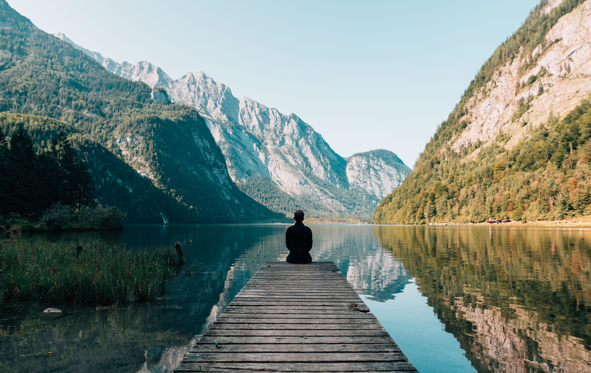
I’m scrolling, trying to discern the texture of the third velvet cushion from the 23rd hand-thrown ceramic vase. It’s hard to concentrate, frankly. I stepped in something wet earlier, a puddle or a spill, and the cold dampness creeping up the back of my foot inside my sock is a far more immediate and visceral sensation than the supposed hygge emanating from these perfectly composed frames. This is the aesthetic paradox of the sad beige internet: a relentless, clinical pursuit of ‘comfort’ that leaves the viewer feeling strangely sterile, like a freshly sanitized waiting room.
It’s not style we are observing. It’s data entry. We look at an endless river of unbleached linen, matte white walls, and carefully positioned pampas grass, and we assume this collective agreement signals a sophisticated, refined taste. But the deeper, colder truth-the one that feels like stepping into that unexpected chill-is that this visual consensus is not a shared preference. It is a calculated, defensive mechanism, a survival strategy deployed against the great, invisible curator: the Algorithm.
The Transaction: Paying the Aesthetic Tax
The pattern is always the same. If you are trying to make a living, or even just gain attention, on a major visual platform, you are subject to the platform’s internal logic. And the platforms, driven by engagement metrics and retention cycles, favor predictability. They favor low-risk contrast, smooth transitions, and visual themes that signal ‘quality’ without demanding intense emotional investment. Color is volatile. True, saturated color carries meaning, mood, and sometimes, political baggage. But beige? Beige is safe harbor. Beige is the visual equivalent of background music-it exists, but it doesn’t interrupt the transaction.
Aesthetic Tax Paid
“It’s an aesthetic tax paid to the platform gods for the privilege of being seen.”
Think about the feed structure. A user scrolls past 373 posts a day, minimum. If your post looks dramatically different-if it has high-contrast shadows, unexpected color saturation, or an image composition that requires the user to pause and interpret complex visual data-you risk two things: the quick flick past (low dwell time) and, more dangerously, confusing the machine vision that categorizes your content. The beige aesthetic is optimized for immediate, non-threatening categorization: *Aspirational Home. Consistent Quality. Safe for Advertising.*
The Betrayal of the Moment
Hollow Polish
Visceral Reality
I’ve tried it. I spent one grim afternoon trying to filter a batch of photos-photos I actually loved, filled with the specific, messy color of my real life-into the approved palette. I spent about 43 minutes wrestling with the hues and saturation settings, trying to drain the life out of a perfectly good magenta throw blanket and turn it into a vaguely taupe accent. It looked technically *better* in the context of the feed I was mimicking, but it felt hollow. It felt like a betrayal of the moment I had captured. That’s the core contradiction: we criticize the uniformity, yet the pressure to conform, to achieve that high polish, often forces us to drain the genuine color from our own experiences.
The Jucnture of Control
This is where we acknowledge the necessity of tools-not just tools to *enhance*, but tools to *differentiate*. The sad beige aesthetic is often rooted in the fear that genuine, bold expression will look amateurish or poorly edited. We need to start using our capabilities to fight back, to introduce noise and truth and specific color back into the stream.
To achieve this, we look to platforms enabling granular control, like: melhorar foto ai, enabling professional-grade editing that celebrates visual difference.
We move now to the reality where color dictates detection: the case of the fire investigator.
The Fire Investigator: Truth in Soot
There is a man named Jordan C.M. He’s a fire cause investigator, a line of work that absolutely requires him to reject the safe, sanitized perspective. Jordan deals with the stark, irreversible reality of destruction. When he analyzes a burned-out structure, he is looking for things that are profoundly specific: the precise color gradient of soot indicating temperature, the melt pattern of polymers, the way smoke deposits trace pathways that defy neat aesthetic lines. He finds truth in chaos, in high contrast, in things that are fundamentally ugly and irregular. He can’t afford to filter his reality to look aspirational; his job depends on seeing the brutal, high-fidelity facts of the scene.
“The difference between a successful investigation and a cold case often comes down to documenting the exact shade of yellowing in a piece of melted metal-a visual truth that would be instantly neutralized, erased, by a beige filter applied for an algorithmic feed.”
That’s the difference between documenting reality and aestheticizing denial. When we choose the Sad Beige Life, we choose to live in a low-information environment, sacrificing the hard, colorful truths for a soft, easily digestible lie. We are actively training ourselves, and our audiences, to ignore the crucial details.
Physical Contagion: When Reality Conforms
4/5
Items Purchased to “Look Right”
And it leaks. Of course, it leaks. When your digital portfolio demands that your apartment, your clothes, and your coffee order exist within the narrow spectrum of ‘elevated neutrality,’ soon your physical reality conforms. You buy the light wood furniture because it photographs well. You choose the oatmeal sweater because it guarantees an aesthetically cohesive background for your close-up product shot. You sacrifice the electric teal chair you actually love because it would ‘break the feed.’ We aren’t curating our lives anymore; we are staging our lives for maximum visibility, and that staging requires the elimination of disruptive, genuine self-expression.
Permission to Offend
I once tried to design a logo for a friend, a graphic designer who insisted the entire mood board had to be derived from 33 shades of warm gray and cream. After two weeks of rendering the visual equivalent of a gentle sigh, I realized that true creativity sometimes requires the permission to offend the homogeneity of the prevailing mood. It requires the permission to use the primary colors that are currently being exiled from the professional Instagram sphere.